In honor of Halloween (or Samhain, if you prefer), I'd like to showcase another record label whose art and design I admire: Death Waltz Recording Company. This UK-based label specializes in reissuing original soundtracks from horror films, some as recent as Let The Right One In (2008) and as vintage as Zombi (1979).
Death Waltz is a new enterprise, so they only have a handful of releases available. Despite their youth, the label has already reached cult status; this is in part because the film scores they release come from more-or-less underground horror movies, but it's also because they have managed to gather a roster of top-notch artists to render the covers. The series initially possessed a visual unity by framing each image in blue and black, but the 2 most recent releases, Halloween 2 and Halloween 3, depart from that convention (but still look great). Many of these releases are already out of print, so if this stuff looks good to you, you'd better hop to it!
In case it isn't obvious, I am not afraid of color. This has been a point of consternation for more than one of my professors here at UB (present company excluded), but I just can't help myself! Bold colors make me so very happy!!!
In scenarios where it's appropriate to work with a fairly wide palette of colors, I find the most unified-looking color combinations are ones which purposefully exclude at least one primary and one secondary hue and their surrounding tertiaries. For example, try reds, purples, and blues, add some orange and teal accents, but exclude yellow and green and everything in between.
You can experiment with this and many more ideas at the ColourLovers website. It's a great resource for all things RGB/hexadecimal, plus you can author and store your own palettes and patterns there.
When a design calls for chromatic simplicity, I often have a hard time paring things down. That's when I turn to the Color Scheme Designer for help.
Click anywhere on the giant color wheel, choose one of the palette dials at the top on the left, and then you will get results that pivot around as many as 4 hues (tetrad), or as few as a single hue (mono). The new and improved CSD 3.0 is especially awesome because you can play with your palette in the following ways: adjust saturation and contrast; get detailed hexadecimal information on every color you see; preview how black, grey, or white text will read on top of each color; and even see your color scheme at work in sample "light" and "dark" page layouts. It's super handy!
Finally, Have you ever seen a shirt, a painting, a rug, a room, a garden, a building, or even whole landscape or street scene where all the colors seemed to be working in a pleasing way? Next time it happens, break out your camera phone, snap a picture, and upload your image to Color Hunter. This nifty site creates palettes for you by pulling colors out of your image. They have created a palette database by selecting images from flikr, and you can search for color schemes using keywords or hexadecimal codes. If you sign up, you can also save a library of favorites. Unfortunately, you CAN'T save your own palette creations, but you can always take a screen shot or jot down the codes for future reference. Below is a palette I made from a photo I took of the most beautiful place I've ever seen: A protected (and deserted) beach that's part of the Sian Ka'an biosphere near Tulum, Mexico:
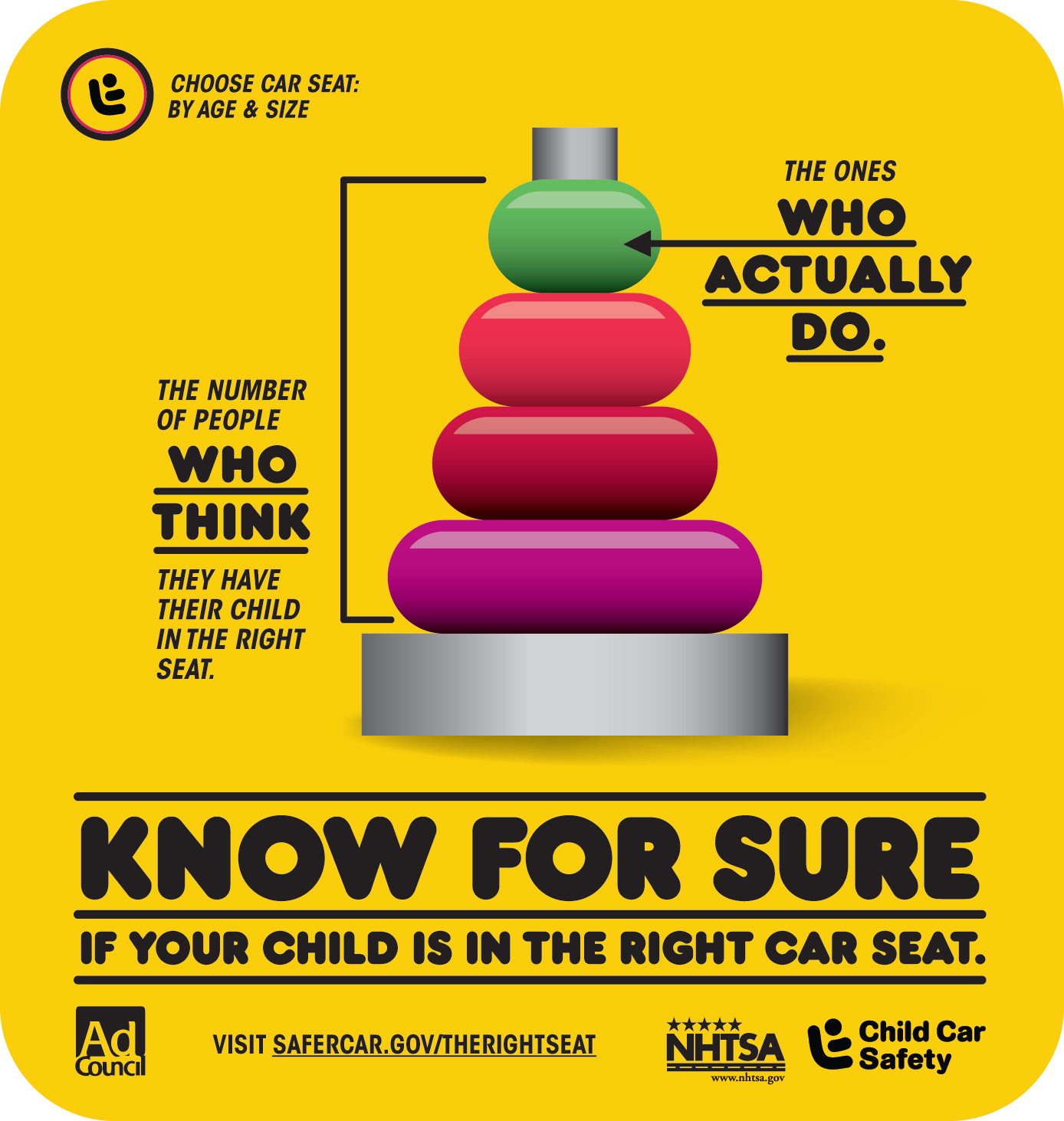
I have passed by the below poster everyday on the way home from our class for the last 7 weeks, and today I finally decided to post about it. As I've been working on our 4th project and searching my mind for visual reference points, my mind keeps coming back to this Popsicle.
I like the way the type hierarchy is handled, and I think the size and simplicity of the graphic is also part of its appeal. That Popsicle silhouette is instantly identifiable, and the colors are bold and attention grabbing. I also like the appropriate use of gradients and shadows to give the object volume and the poster itself depth.
Most importantly, there is one small detail upon which this poster's success hinges: the single falling drop. It's A) a nice visual reminder that the presented statistic pertains not to a faceless mass but to a group of individuals, and B) it's a surrogate for the implied subject of this whole campaign (not actually pictured in any of these posters)--the vulnerable child. The associations my mind makes are immediate and clear: I see a suspended drop, separated from the larger whole and being pulled in slow motion to the solid inevitability of the ground. It makes me think, naturally, of a car accident .... also happening in slow motion, and a child flying through the air. When I take a moment to think, it really seems amazing that such a deceptively simple graphic can pack so much behind it. This, of course, is just my interpretation of it. Perhaps others see nothing more than a dripping strawberry ice cream.
Below are some of the other posters from the campaign. While I really like all the graphics and layouts from a design point of view, I think the above is the only one that manages to convey both humanness and the necessary gravitas. In its subtle way, the poster points to the threat of tragedy upon which any child safety campaign must float.
As far as I'm concerned, one of the most important UK exports in recent memory is not a sports team, actor, or band, but a TV show: The Mighty Boosh.
Based on a series of stage shows originally performed in the late 1990s, the show is the brain child of two British comedians, Julian Barratt and Noel Fielding.
These two--along with a few other funny folks (including Noel's baby bro, Michael)--are a kind of mod 'Odd Couple' whose silly adventures seem to defy the laws of physics, gravity, and (at times) common decency. Alas, there are only 3 seasons, and each revolves around a different locale: Zoo, London flat, Fashion Boutique. The art direction and costume design is fun, colorful, and often downright surreal.
Also, look at Noel! I mean, he's sooooooo dreamy... right? You know, in that Vyvyan, from The Young Ones kind of way?? No???
Sigh........
Er, um... anyway.... let's drag this post back on track, shall we?
What does any of this have to do with smart phone technology and apps, you ask? Weeeeeeeell, my first smart phone was a Blackberry, and I hated it (surprise surprise). When I began to think about replacing it, I was really quite torn between the droid and the iPhone. What was it that inevitably led me to the latter? Sleek design? Improved usability? Attractive interface?
Of course, by the time my 2 year term was up and I was eligible for an upgrade, The Mighty Deciderwas no longer available in the US. I am currently searching for a way around this that doesn't involve hacking my own phone.... I will keep you posted.
In the mean time, I shall address the burning question: What does it do? Well, it has no pragmatic purpose whatsoever, except that it UNVEILS EVERY MYSTERY OF THE UNIVERSE FOR YOU, ONE QUESTION AT A TIME!! By that, I mean it's a glorified magic 8 ball that takes the shape of 5 different characters form the show (depending upon which one you choose) and responds to your queries with a set of appropriately ridiculous responses. Below is a clip of the cast playing with it:
Aaaaand here is a far more useful clip which shows some of the actual features of the app. This one helps you through difficult either/or type quandaries--Coin Flip with the Crack Fox (yes, there's an urban fox who lives off a steady diet of crack on the show):
You can also spin the bottle, call upon Naboo's Wisdom or Ask The Moon, but don't be surprised if you are told that "Um, maybe if you, um, dress up as a clown and come back and see me I'll give you a proper answer. Until then, I'm gonna have to remain silent."
One issue I'm considering working with on project 4 is gay marriage. While doing some research, I came across this image.
The poster is provocative in many ways, some obvious and some less so. The photograph has impact not because it features a cute animal or an unfolded tragedy. When we look at a poster of a puppy behind bars at the pound, or a battered woman's face, or the twisted metal of a DUI-related car crash, we know immediately how we ought to respond. Not only that, the creator of the poster is banking on the fact that most people are going to respond to the image in the same way; empathetically, sympathetically, angrily, etc. The authors of this poster, however, have assembled text and images which deliberately polarize. One viewer may see a scene of intimacy, love, and beauty, and feel a sense of warmth in response to it. The next might see a gruesome atrocity, a perversion of nature, and the image might make that viewer very uncomfortable, angry, or even sickened.
The poster works because it looks on the surface like it's for and about gay men, but it's really quite the opposite. The red line of text might literal read "Let us help him," but it could also be a finger pointed at the viewer: "Let us help YOU." The poster demands the attention of its intended audience first by shocking and infuriating him, and then by asking him to pause, acknowledge, and re-evaluate those feelings. Here, intolerance is the disease, not homosexuality.
My only qualm with this campaign is that it hinges necessarily on homophobia (and homosexuality???) being a strictly male enterprise.
With the Causes app on Facebook, it's never been easier to identify a call to action. My account has been inundated with them, recently. There are 2 or 3 "friends" who are unusually prolific when it comes to sharing things they "really believe in" and asking me "to join [them] in supporting it."
Don't get me wrong, I'm glad FB has a platform for people to share their beliefs and organize support, but it does feel a little bit like someone is plastering flyers all over my front door. The (often compelling) messages and (yes) calls to action with which these causes are infused become irrevocably diluted in this format (namely, the Causes app). I don't think anyone views their personal Facebook page as public bulletin board, so the weight and import of the causes themselves become lost under the invasiveness of the act which brought them to the viewer's attention.
I will always feel more closely connected to a cause that I come to of my own accord, like when I decide to pick up and keep a pamphlet, or sign a petition, or donate my hard-earned money, or (gasp!) try to get others to do the same. It takes a hell of a lot more skill and effort to take a riveting photo, pair it with a provocative caption, and get someone to care about it than it does to click a single button and send the same generic request (regardless of the topic) to 500 of your "closest" friends.
What are some of your favorite words? This is a question most people who call themselves writers answer very quickly. I, on the other hand, am one of those people who draws a blank every time. It's embarrassing. Luckily, I've been thinking about it for a few days now and am not completely empty-handed. I will come back and add to this throughout the rest of my semester. This way, I'll always have a list to refer to


