Saturday, September 29, 2012

Project 2 Emergency: Feedback Requested

1. THE PROBLEM

When we went over our P 2 writing earlier today, I realized two important things: One, I have a general tendency to overstate my point and include too much information when writing a first draft; Second, I fear that even the most aggressive editing and cutting will not whittle my process booklet down to a manageable size for presentation next week.

I know my peer reviewers, Emily K. and Michelle C., will not agree. They think it can be done, and I appreciate the encouragement more than I can say, but I'm just not sure it's enough. The topic is (was) self-releasing your own music, and that's a fascinating subject I could go on and on about. In my draft, I did in fact go on and on (so much so, I had only time to make a dummy out of 3 folded blank sheets of paper before passing out at 4:30 AM). Clearly, I've bitten off more than I can chew

There are few things that make me feel worse than turning in shoddy or half-finished work. We're all very busy, working adults, and we also happen to have a ton of work in this class (this week especially), so I hope some of you will empathize with my decision to strap on my parachute and bail out of this idea, ASAP.

2. THE SOLUTION?

My original idea was to create an amusing how-to with single-sentence steps and simple illustrations. As I walked by Meredith's adorable "How to Go Sledding" booklet earlier today, I began to realize the gravity of my error. In my longing for something less complicated that will also be fun to illustrate, I have come up with with the following proposal:

--------------------------------------------------------------------
 How to Administer Ear Drops or Ointment to a Resisting Cat
  1. PLAN YOUR TIMING: Cats are easier to handle when they're sleepy. Wait to make your move until your kitty is napping or just waking up.
  2. PREPARE YOUR TOOLS: Find a pair of thick gloves (not mittens) and a towel you don't care about. If you have pheromone spray, apply some onto the towel. Unscrew the dropper/lid from the medicine and place the bottle or tube in your pocket. Put on your gloves. Do these things outside of your cat's line-of-sight.
  3. PROCEED WITH CAUTION AND CONFIDENCE: Even a sleeping cat knows when you're nervous. Channel your inner ninja and act silently, quickly, and deliberately. Remember, the element of surprise is key. If your cat gets wind of your plan, all hope is lost.
  4. EMPLOY THE REAR-FACING "BURRITO KITTY " METHOD: Grip the long edge of the towel with your hands about foot apart, and approach your (ideally) oblivious cat from the rear. Quickly place and wrap the towel around your cat so that only her head is exposed, and simultaneously kneel behind her so that she can't wiggle her way out backwards.
  5. IF YOUR CAT FLEES, MAKE CHASE. Continue chasing your cat until you have successfully completed step 4.
  6. BE GENTLE. Hold your cat steady and speak to her in a low, calm voice. She may loudly vocalize her opinion about the situation, but that's normal. Tell her everything is going to be okay and continue.
  7. ADMINISTER THE MEDICINE: Make sure your cat is firmly swaddled with no stray paws on the loose. Carefully retrieve the medicine from your pocket with one hand while keeping a secure hold on your burrito kitty with your other hand. Apply fluid or ointment as directed by your veterinarian.
  8. RELEASE YOUR BURRITO KITTY: Now that it's all over, you can free your furious feline and let her run and hide in the closet. Be aware that she will probably shake her head a lot and send medicated ointment flying everywhere as she beats her hasty retreat. 
  9. END ON A POSITIVE NOTE: Clean up the ointment mess, and then coax your kitty out of hiding with some catnip or another favorite treat. Have a snuggle, and ask her to forgive and forget. This step is important because you're probably going to have to repeat this procedure twice a day for the next 2 weeks.
 --------------------------------------------------------------------

That's it for now. Any feedback on the concept and execution (images excluded) is needed and appreciated!

Wednesday, September 26, 2012

Show & Tell 3.0: La Dolce Vita

I don't have a TV, so I'm not exposed to many commercials--a great source for concepts. In order to come up with something for this post, I grabbed a copy of Vogue. This month's issue has Keira Knightley on the cover (who I absolutely love, but that's irrelevant), and--as is typical for the season--some incredible fall fashion spreads.

via
Now, please understand that I do love clothes but am not by any means a follower of haute couture (just as I'm not a follower of gourmet cuisine, high art, or anything so exclusive and pretentious). Some of the clothing is cool, but I can't afford any of it, the industry is generally awful, and all the severe-looking tautly thin supermodels drive me nuts. Despite all this, I find that I have an appreciation for ad campaigns that have a clear aesthetic thrust about them, especially those that focus on the style of bygone eras such as this early 20th century train-themed ad for Louis Vuitton.

When I saw the spread for Dolce & Gabana, I instantly fell in love with it. If I were to sum up the concept in 5 words or less, I would say it's timeless and classically Italian. The images smack of Fellini's films, 8 1/2 in particular, as well as Coppola's epic Godfather II. I'm not talking about gangsters here, but the images are definitely about la famiglia.


Although the sources of inspiration for this series of photos are easily identifiable, the old-world Italian theme is handled with such reverence and warmth and that it truly stands apart from many of the other spreads featured in the issue. The subjects in fashion photography are frequently hard, joyless, and dehumanized (consider the Vuitton image, where the models' soulless eyes and expressions make them look more like ghosts than train passengers), so I love these D&G ads because they are full of life and energy: they are HUMAN.

The photos are beautifully arranged tableaux; they're theatrical, noisy, and I can almost hear people arguing animatedly in Italian. I also appreciate that the models represent a wide variety of ages and silhouettes, and the multi-generational  tone is reinforcing a message that there's something for everyone at D&G (although you'd better have a fat wad in your wallet if you expect to walk away with anything other than a pair of socks). Please scroll through, click to enlarge, and enjoy, che bellezza!


Monday, September 24, 2012

Behavioral Patterns


Sometimes when I walk into a Barnes & Noble, I find a really beautifully put-together art magazine that I decide needs to come home with me. It inevitably winds up costing $15-$30 for a slim volume of work, but I am a good consumer, and I can't help myself. These "boutique" art magazines are created specifically for people like me (and many of you): design magpies.

This week, I flew off with a copy of IdN (an International Designers Network publication). The magazine, though thin, is perfect bound with a nice heavyweight, satin-finish coated card stock cover and an iridescent foil stamp (oooh shiney) with the title: The Shapes-In-Pattern Issue. More than a dozen artists and studios are featured whose work reflects the concept of pattern in a wide variety off mediums--the issue even includes a 90 minute DVD of motion collages.

I looooove well-conceived patterns and was already super excited about this find, but once I realized the work of American artist Andy Gilmore was featured in the issue I almost lost my mind. One of my favorite electronic artists, the London-based Gold Panda, has used Gilmore's work on the covers of several of his 12" and 7" singles (Gilmore is essentially a resident visual artist at the record label, Ghostly International). In IdN, he says that "A good pattern is about harmony in all of its elements--form, color, composition, etc." It sounds simple enough, but his work is so complex, so vibrant, and so beautiful, it makes me cry prismatic rainbow tears. If you're anything like me, please grab a hankie before you scroll down this post to see what I mean.


Thursday, September 20, 2012

Show & Tell 2.0: Designing Data

During my third round of searching for compelling infographics (I swore I would not be distracted this time by cartoons), I came across a wonderful blog called Information is Beautiful, created by information designer David McCandless. A book of his work is available through the site, and the UK edition sports part of the below image on its front cover (please click to enlarge!):


What you're looking at is a kind of ethnographic color wheel that illustrates the various chromatic connections different cultures make with emotions, objects, and states of being. In South America, green is the color of death; in Japan, orange is the color of energy; silver represents peace, purity, and truce in Muslim cultures; and red is the color of success in Asian and Native American cultures. To me, it's an especially fascinating example of infographics because the role of color is not tertiary or  secondary--it's primary and at the very essence of the information the graph is setting out to convey. Color is an incredibly important aspect of how images mean, and I like that this piece is pointing out how different things can look depending upon where you're coming from.

It's a pretty amazing visual, and it's also just the tip of the iceberg. This website is absolutely full of striking looking data on everything from Peak Break-Up Times on Facebook to an interactive visualization of the effectiveness of dietary supplements on particular diseases and conditions. Also, another interactive winner designed by McCandless: a visualization of the Drake Equation, an actual mathematical statement conceived in 1961 by American astronomer and astrophysicist Frank Drake which calculates the potential number of alien civilizations in our galaxy and the visible universe. Awesome.

Tuesday, September 18, 2012

Subway Semiotics

I have (sadly) never been to Japan, but I find that I am alternately captivated and confused by their public signage. Their subway signs in particular seem to have piqued the interest of not only me but a great many other bloggers. This may be because these signs aren't simply pointing to the nearest exit or instructing you not to litter; they are attempting to provide some behavioral guidelines . . . a framework for acceptable and unacceptable subway etiquette. Signs like these can't help but speak volumes (in just a few words) about both a culture and a communication style that is very different from our own.

As a preamble, I found these on photographer Robert Francis' photostream entitled signs.  Here, we have an unfortunate critter whose porcine posterior has been set ablaze by a careless subway rider's cigarette:
 
Francis speculates that this may serve as a reminder to smokers that there are children around whose height could put them well within the trajectory of flying cigarette ash/embers/butts.

From the same photostream, we also have this poor fellow:
This sign seems to be warning the viewer not to run into closed train doors. I don't know, but I think I probably didn't need a sign to help me avoid this situation. None-the-less, I love the cartoon.

Further research reveals that there is a whole series of Japanese subway posters having to do with rider etiquette that revolves around different themes, many of which can be discovered at inventorspot.com. In 2009, the first posters from the "Please Do It" campaign --as in Please do that somewhere else and not here on a crowded train car--began appearing in stations and on trains. These were created by graphic artist Bunpei Yorifuji, and have been re-posted, re-captioned, and re-interpreted (sometimes quite profanely) a hundred times over. Most of the depicted parables of inconsiderate behavior I encountered make sense, although some of them were a little esoteric.
via

Personally, I'm impressed by the thoroughness of this person's transformation on a bumpy public train. She must have a steady hand. I must say, of all the behaviors I've seen people exhibit on public transit in Baltimore, applying make-up seems awfully inoffensive to me. You go ahead and pile that pancake on, girl.

On the eve of the iPhone5, here's another one that seems unlikely to resonate with Americans:
via
Clearly, the artist doesn't realize she has to do it on the subway; It's illegal to cry on the phone with your jerk boyfriend while driving a car. Where else is she going to do it?

Seriously though, the messages begin to get a little bizarre after a certain point. For example, I love vacationing on the coast, but I have never made whatever is going on here a part of my itinerary:
via
Um, what?
And something seems lost in the translation here, too....

via
What exactly is happening here? Is he practicing his golf swing? Summoning a hailstorm? Preparing for the imminent zombie onslaught? No idea, but apparently Japanese custom dictates he'd better take it out front before he breaks something.

I'm not sure what conclusion to draw from these. It's true that part of the content is in a language I don't understand, but these posters are relying primarily on their visual weight to convey their message. It seems as though, even with the aid of English captions, the tone of a visually communicated statement is culturally loaded . . . sometimes to the point of being utterly incomprehensible. There are many more posters from this series to see; just do a Google image search
, but beware of imposters (anything pornographic, scatological,  or featuring a bong is unlikely to be the work of Yorifuji). I would love to hear other peoples impressions of these....


Sunday, September 16, 2012

Better eat your Oatmeal

If you're thinking of adopting a humorous tone for our next assignment, here's some inspiration for project 2.

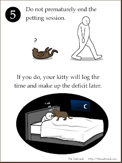
I can't remember how or when or through whom I discovered The Oatmeal, but it was probably the best day of my life. It was definitely at least the best day of my week, whenever it was. For those of you who are unfamiliar (I can't imagine there are very many of you), you might say The Oatmeal is a serialized graphic representation of web designer Matthew Inman's internal dialog with the world around him. Consisting of a collection of simply rendered comic panels, The Oatmeal includes very many instructional info-graphs. "How to Pet a Kitty" is a perennial favorite:


Not all of Inman's humor is lighthearted; sometimes, it can get a little dark. But that's okay, I still admire his execution. The drawings aren't pretty, and the copy isn't complex or erudite, but something about his comics' cadence and simplicity is pitch perfect.

Just in case you're not sold, here are some more instructional guides to persuade you:
"How To Use A Semicolon"
"How To Tell If The Weather Is Going To Be Really Bad"
"How To Fix Any Computer"
"How To Tell If Your Cat Is Plotting To Kill You"
this is not a how-to but it's funny and about designers

Friday, September 14, 2012

Show & Tell 1.0: The Poetics of Food

I don't really have any familiarity with haute cuisine and the critical culture that surrounds it. The one-two punch of a tight budget and a wish to stay vegetarian (24 years and counting) excludes me from much that is expensive, elegant, and extravagant. Luckily, in the age of the blog, being a "foodie" doesn't have to mean dropping 4 figures at one of Cindy Wolf's restaurants, to give a local example. These days, a food article about the most amazing meatball sub can slide neatly in between the ones about beignets and beurre blanc. In these economically troubling times especially, food writers who want to remain relevant must be unpretentious as well as Epicurean.

In my admittedly limited research, it seems that the most beloved food writers understand that you are just as likely to peel away a greasy wrapper to paradise with a pit beef sandwich from a street vendor as you are to find it within a Restuarant Week prix fixe menu. There is a poetry to this kind of food writing, a reverence that swirls up not from the food itself but from the culture and ritual that surrounds and informs it. I picked up on this sense of poetics quite a lot while reading Ruth Reichl's blog.

via


I initially discovered her on mashable.com, where she's been named one of 10 Food Writers and Critics to Follow on Twitter. Once a staple contributor to the New York Times Food section and editor-in-chief of Gourmet magazine, she has written several books (including a 1000+ recipe cookbook) and now both produces and hosts food shows on PBS. It doesn't take long to discover that Reichl is just as comfortable with a wood stove and benches as she is with crystal and white table cloths. She also stresses the powerful ties between food and cultural identity, which is something I'd like to explore with our first project.

Here are a couple of favorites (blog posts, et al.) that I've read so far:
breakfast at an LA foodtruck
where to eat when you're in Paris
how to make a better grilled cheese sandwich (YES!!!)
on Alice Waters and Chez Panisse

Enjoy....


Wednesday, September 12, 2012

Obligatory Food-Related Post...

Today, I want to talk about all the weird candy I used to eat when I was a kid. Hopefully I'm not dating myself too horribly by doing this, but I have memories of a lot of bizarre stuff that, for whatever reason, passed off as "edible" to my and many other 5-15 year-old palates back in the 1980s. Let's review:

1. Raise your hand if you ever got a ream of these at a truck stop on some long ago summertime road trip?

Dot Candy                                               via
Now raise your other hand if you spent as much time pulling bits of paper pulp out of your mouth as you did enjoying your food-colored sugar.

2. Speaking of trips, remember how your parents refused to go to Great Adventure (AKA Six Flags) and kept taking you to Colonial Williamsburg instead? This also applies to those of you who wanted to go to McDonald's as a child and kept getting re-routed (usually due to the presence of a Grandparent of some sort) to the nearest Cracker Barrel. To those people, I present your consolation prize.

Stick Candy                           via

3. It always seemed perfectly reasonable that if you drank enough of these, you would eventually not be thirsty anymore, right?

Nik-L-Nips                            via
 In hindsight, not really very reasonable.

4. Hey! What goes swell with drinking? Well, once upon a time, candy cigarettes were all the rage. Then, they were removed from the market for allegedly contributing to the rise in minors addicted to smoking (never mind the fact that they tasted like sidewalk chalk). Given this trajectory, I always found it odd that this product slid under the radar.

Big League Chew                     via
I shared some with a co-worker last week. Still delicious. No spitting required.

5. I could go on and on, but I'm tired, so I'll leave you with my personal childhood favorite. It's a rock! No, it's candy! No, it's....

Rock Candy
via
There's really nothing bad I can say about rock candy. Nothing but smiles over here.

Judging by a Cold Busted Cover

At my job, I spend precious hours of my life looking at new release books. Every week, there are MANY of these books, so I must not pause for too long on each page, on each title, all of them cheaply and shamelessly promising me waves of sonic ecstasy and enormous popularity and profitability. Most of the text on a one-sheet is, not surprisingly, hyperbolic and not to be trusted. I often rely on my own knowledge to help me make a decision: No. Or, Yes! And then, how many? Sometimes, I benchmark earlier releases and see how well they sold. If the artist in question is outside my areas of interest and expertise, I will call upon my colleagues for their input. 

Other times, I just wing it. And that, ladies and gentlemen, is when a well designed album cover becomes oh-so-incredibly important. I have put in for dozens of releases (of which I had zero prior familiarity) based a teeny-bit on their writeup and a humongous chunk on their artwork.

Enter: Cold Busted, a new label distributed by one of our trusted hip-hop vendors, Fatbeats.


I came across these folks this past week, love love LOVED everything I saw and ordered all of it as a result. So twitterpatted was I by the colorfully vintage and geometrically bold designs, I walked the extra mile over to their Facebook page, gave them the proverbial 'thumbs up', and drooled a bit into their comment box. They responded with humble thanks and free goodies both for me and my customers. I was especially taken with the art for their first 12" release, an instrumentals compilation called "This Is How It Should Be Done." Truer words have never been spoken.
 Oh, yes. This one is definitely coming home with me ... maybe these too:


The lesson here, which may or may not be an unfortunate one, is that people judge books by their covers all the time. Whether they should or shouldn't is a moot point. We live in a vibrant, visual culture where a kaleidoscopic revolving door of stimuli awaits us the moment we walk out the front door, or turn on the TV, or the computer, or the phone. A compelling narrative will keep us reading, and a catchy hook and a dope beat will keep us listening, but it's not the end of the world if a beautiful cover gets that book or that record in our hands.